AheadCreativeDutaforce — nothing extra
Read more about the project
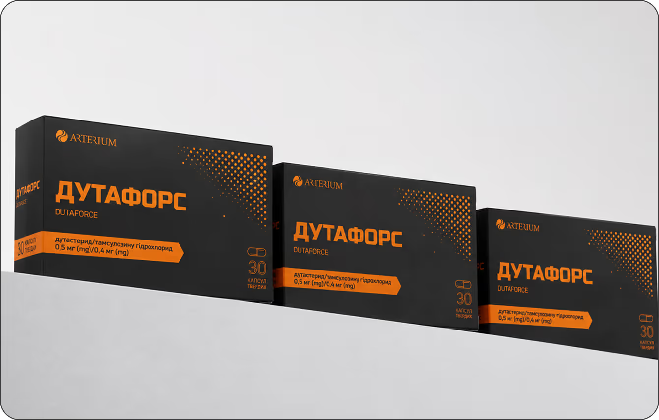
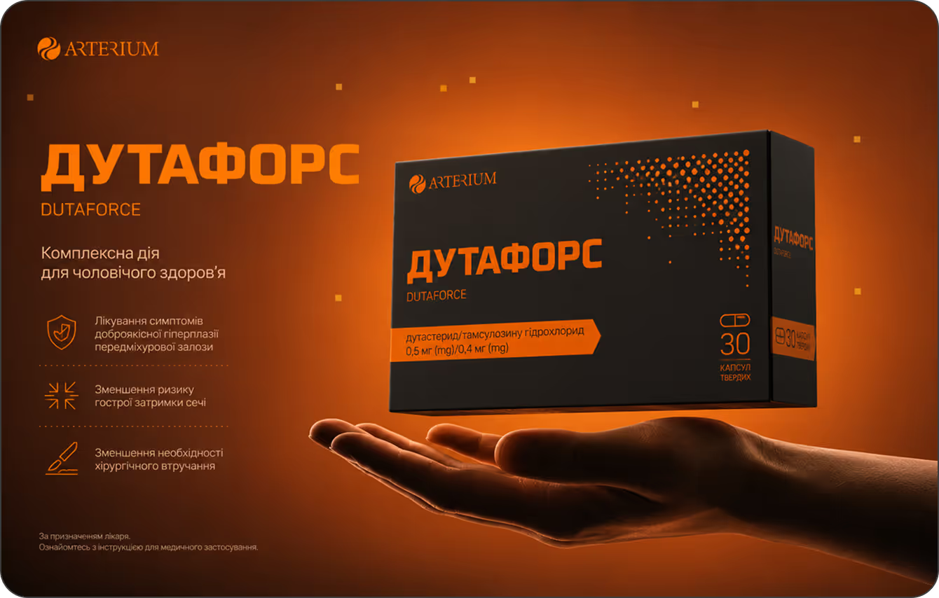
Arterium is one of the leaders in the Ukrainian pharmaceutical market. Millions know their products, but knowing and trusting are two different things. That is where our work begins. Dutaforce is a medication for men with prostate conditions. It reduces the symptoms of benign prostatic hyperplasia, lowers the risk of acute complications, and helps avoid surgery. Serious therapy for a serious audience. The task: to create a packaging and blister design that speaks to this audience in their own language — without unnecessary words or attempts to soften the subject. Minimalism. A clear grid. Restrained color blocks. Every element is justified by its function — nothing is there just for the sake of aesthetics.

ConclusionA design that works just like the medication itself — no fluff, straight to the results.
There are products where design is meant to impress, and others where it is meant to convince. Dutaforce belongs to the latter. Its audience isn't looking for bright colors or complex imagery. They are looking for confidence and clarity.
We stripped away everything that didn't serve this idea. We kept only what communicates that this medication is serious, proven, and effective. Here, minimalism is not just a stylistic choice, but a communication strategy.
Dutaforce is recognizable and memorable precisely because it has nothing extra. Sometimes the most powerful solution is the one you decide to leave out.
