AheadCreativeKatana — a new product in a familiar brand world
Read more about the project
Katana is a brand with its own character and style—a reputation built over years. When launching a new product, the goal isn't to break what already works, but to integrate it seamlessly into the existing brand ecosystem.
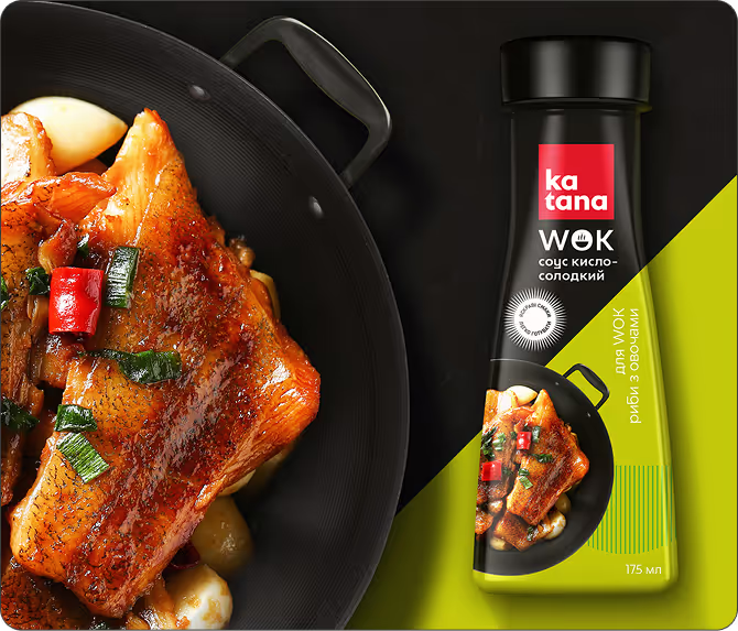
The new WOK sauce series needed to be intuitive at a glance: what it is, how to use it, and what to pair it with. No extra words—just design. Each sauce was given its own focus: product photography, ingredients, and color. It’s concise—the name, the key ingredient, and the vibe. Warm colors and appetizing photography ensure that shoppers don't need to read the label to imagine the taste.



ConclusionIdentity in action, taste in the spotlight
Expanding a product line is always a risk. A new product can look out of place, disrupt shelf logic, or simply get lost among the others. That didn't happen with Katana.
The WOK sauce series is a logical continuation of the brand's story: the same style, the same simplicity, the same character. At the same time, each sauce has its own distinct focus, allowing consumers to immediately understand the differences and know how to use them.
Design that looks simple actually solves several problems at once: brand recognition, product differentiation, and usage cues. All of this on a single package.
